Seeing Clearly: Why the Right View of Attendance Data Matters — Kingdom Metrics

Most church leaders have attendance numbers, but do they have attendance insights?
Raw data on a spreadsheet can tell you how many people showed up last Sunday, but without the right visualization, key trends get lost. Averages, capacity percentages, and long-term patterns can make the difference between reactive decision-making and proactive leadership.
Why Trends Matter More Than One-Week Numbers
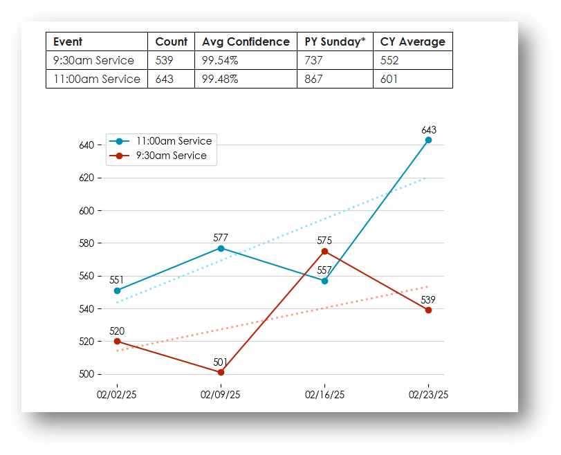
Looking at 4-week, 12-week, and 12-month trends helps churches see growth patterns, seasonal shifts, and long-term momentum. Instead of reacting to a single high or low week, leaders can base decisions on stable trends and real capacity data.
Example: When to Add a Service or Expand Your Building
Imagine your church auditorium seats 500 people. Over the past 12 weeks, your attendance has averaged 400 per week (80% full), with some weeks hitting 450+ (90%).
With this data, a pastor can confidently decide:
✅ It’s time to add a second service to prevent overcrowding.
✅ We need a building fund strategy because our space won’t support future growth.
Without a clear visualization of these trends, that same pastor might have looked at last Sunday’s attendance (350) (70%) and thought, “We’re fine for now.” Meanwhile, the bigger trend says growth is pushing the limits.
Seeing Your Data the Right Way
Effective attendance tracking isn’t just about numbers—it’s about clarity. Seeing data in a dashboard, chart, or trendline, rather than an overwhelming spreadsheet, helps pastors make smarter, faster, and more confident decisions.
📊 If you’re ready to move beyond spreadsheets and into real insights, let’s talk. kingdommetrics.com